Table of Contents
ToggleMonochrome interior design strips away the noise. Instead of juggling multiple colors, finishes, and patterns, homeowners commit to variations of a single hue, typically black, white, gray, or occasionally a bold tone like navy or olive. The result? Spaces that feel cohesive, intentional, and surprisingly complex when executed correctly. It’s not about sterile minimalism or bland walls. Done right, monochrome interiors reveal depth through texture, contrast, and strategic lighting. For DIYers tackling a refresh or full remodel, this approach simplifies paint selection, material coordination, and furniture choices, but demands attention to detail that multi-color schemes can often mask.
Key Takeaways
- Monochrome interior design uses variations of a single color family—whites, grays, blacks, or bold tones—to create cohesive, intentional spaces that feel larger and photograph well for resale.
- Texture, layering, and strategic lighting are essential to prevent monochrome interiors from appearing flat; vary paint sheens, mix materials, and use multiple light sources at different heights and color temperatures.
- Include at least three distinct values (light, medium, dark) within your monochrome palette to add depth, and introduce visual interest through geometric patterns, natural materials, and metallic finishes rather than color.
- Test paint and material samples in actual lighting conditions on multiple walls and at different times of day, as undertones like blue-gray versus warm gray can dramatically affect how a monochrome scheme reads.
- Avoid common mistakes like skipping texture, ignoring undertones, overlighting or underlighting, and rushing material selection—monochrome design requires precision but rewards it with architecturally confident, calm spaces.
- Monochrome design forces focus on craftsmanship and quality materials, simplifying renovation decisions and encouraging investment in better hardware, tile patterns, and finishes over relying on paint color variety.
What Is Monochrome Interior Design?
Monochrome interior design uses variations of a single color throughout a space. This doesn’t mean painting every surface the same shade of beige. Instead, it relies on the full spectrum of tints (adding white), tones (adding gray), and shades (adding black) of one base color.
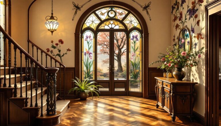
Most monochrome schemes use neutral colors, white, black, gray, or greige, because they offer the widest range of commercially available materials. A white monochrome room might include bright white trim (Sherwin-Williams High Reflective White, for example), warm cream walls, ivory linen curtains, and off-white oak flooring. A black monochrome space could layer charcoal walls, graphite cabinetry, slate tile, and matte black fixtures.
Homeowners can also build monochrome palettes around saturated colors, deep blues, forest greens, or warm terracottas, though sourcing matching materials (flooring, tile, upholstery) becomes harder and more expensive. The key is sticking to one color family and using value contrast (light versus dark) to define surfaces and architectural features.
Why Choose a Monochromatic Color Scheme for Your Home?
A monochrome palette simplifies decision-making during renovation or redecorating. Instead of testing dozens of paint chips against competing accent colors, homeowners select one base and work through its range. This speeds up shopping trips and reduces costly color-matching mistakes.
Monochrome spaces also maximize visual square footage. Without contrasting walls, trim, or furniture breaking up sightlines, rooms feel larger and more continuous. This matters in smaller homes, open-concept layouts, or spaces with challenging proportions, low ceilings, narrow hallways, awkward alcoves.
From a resale perspective, monochrome interiors photograph well and appeal to buyers who want a neutral canvas. Real estate agents consistently recommend gray or white monochrome schemes for staging because they don’t polarize opinions the way bold accent walls or patterned feature tiles can.
Finally, monochrome design forces homeowners to focus on quality over novelty. When color variety isn’t an option, craftsmanship, material choice, and architectural detail become the focal points. That means investing in better hardware, more interesting tile patterns, or higher-grade wood instead of relying on paint to carry the room.
Essential Elements of a Monochrome Interior
Texture and Layering
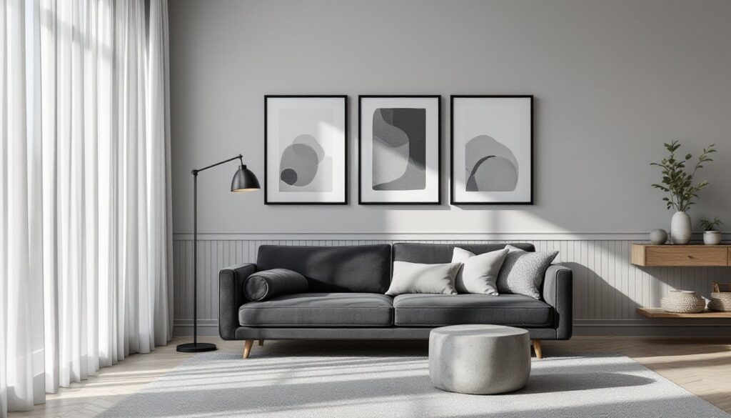
Without color contrast, texture becomes the primary visual tool. Smooth plaster walls need contrast from rough stone tile, woven baskets, linen upholstery, or reclaimed wood shelving. In a white monochrome bathroom, pair glossy subway tile with matte porcelain floor tile, brushed nickel fixtures, and a natural fiber rug. The eye reads these as distinct elements even though the color is uniform.
Layering also applies to sheen levels in paint. Use flat or matte paint on ceilings, eggshell on walls, and satin or semi-gloss on trim and doors. This creates subtle differentiation under natural and artificial light. Many DIYers make the mistake of using one sheen throughout, which flattens the space and makes imperfections more visible.
For flooring, consider mixing materials within the same color family. Wide-plank white oak (actual dimensions typically 5″ to 7″ wide, ¾” thick) pairs well with honed marble or large-format porcelain tile in a similar tone. Grout color matters, use a grout one shade darker than tile to define edges without breaking the monochrome effect.
Lighting Considerations
Monochrome interiors rely heavily on lighting to create depth and mood. Poor lighting turns a sophisticated gray room into a flat, dingy box. Successful monochrome spaces use multiple light sources at different heights and color temperatures.
Start with natural light. If possible, use sheer or light-filtering window treatments instead of heavy drapes. In darker rooms, consider adding a skylight or enlarging existing windows (check local building codes: window changes often require permits, especially in load-bearing walls).
For artificial lighting, layer three types:
- Ambient lighting: recessed LEDs or flush-mount fixtures (aim for 50-75 lumens per square foot in living areas)
- Task lighting: under-cabinet LEDs in kitchens, swing-arm sconces in reading nooks
- Accent lighting: track lights or picture lights to highlight texture or architectural features
Use a consistent color temperature across all bulbs, typically 2700K to 3000K (warm white) for living spaces, or 3500K to 4000K (neutral white) for kitchens and baths. Mixing color temperatures in a monochrome room creates jarring shifts that break the cohesive effect.
Dimmer switches are essential. They allow homeowners to adjust contrast and mood throughout the day without changing the palette. Install LED-compatible dimmers to avoid flickering or buzzing (standard incandescent dimmers don’t always play well with modern LED bulbs).
How to Create a Monochrome Palette Without Losing Depth
The biggest risk in monochrome design is creating a flat, one-dimensional space. Avoiding this requires intentional contrast and variation.
Use value contrast strategically. In a gray monochrome living room, pair charcoal sofas with light gray walls and medium-gray area rugs. The rule of thumb: include at least three distinct values (light, medium, dark) within the same color family. If everything sits in the mid-range, the room feels washed out.
Introduce pattern through geometry, not color. Herringbone tile, board-and-batten paneling, coffered ceilings, and geometric light fixtures all add visual interest without breaking the monochrome rule. In a white kitchen, consider a subway tile backsplash in a vertical stack bond instead of the standard running bond, it’s the same material, but the pattern creates movement.
Incorporate natural materials. Wood grain, stone veining, and woven textiles bring organic variation that prevents monochrome spaces from feeling sterile. A black monochrome bedroom benefits from a live-edge walnut headboard, charcoal linen bedding, and a wool area rug in deep graphite. The wood grain and textile weave provide detail even though the color palette is unified.
Don’t forget metallics. Brushed brass, matte black, polished chrome, or oil-rubbed bronze fixtures act as neutral accents within monochrome schemes. In a beige monochrome bathroom, unlacquered brass faucets will patina over time, adding depth without introducing color.
Test samples in actual lighting. Paint and material samples look different under morning sun versus evening lamplight. Apply 12″ x 12″ test patches of paint on multiple walls and observe them at different times of day before committing. This is especially critical in monochrome schemes, where subtle undertones (blue-gray versus green-gray) can make or break the effect.
Common Mistakes to Avoid in Monochrome Design
Skipping texture. The fastest way to ruin a monochrome space is treating it like a single-finish paint job. If every surface is smooth drywall in the same sheen, the room will feel lifeless. Mix materials: plaster, wood, stone, metal, fabric.
Ignoring undertones. Even within a single color family, undertones shift. A cool gray with blue undertones clashes with a warm gray that leans beige. Before purchasing paint, tile, or fabric, compare samples side by side in natural light. Most paint stores offer peel-and-stick sample sheets that make this easier.
Overlighting or underlighting. Monochrome rooms need more thoughtful lighting than colorful ones. Too much flat overhead light washes out texture. Too little light makes dark monochrome schemes feel oppressive. Use dimmers, multiple sources, and targeted task lighting.
Forgetting contrast. A room with only mid-tone grays or taupes lacks anchor points. Every monochrome palette needs at least one very light and one very dark element, white trim and black window frames, pale walls and deep charcoal furniture.
Rushing material selection. Monochrome design is unforgiving. A mismatched grout color, poorly chosen hardware finish, or off-tone switch plate becomes obvious when there’s no color distraction. Invest time in sourcing materials that truly match your palette. Order samples, bring them home, and live with them before placing full orders.
Monochrome interiors demand precision, but they reward it with spaces that feel cohesive, calm, and architecturally confident. For DIYers willing to invest in quality materials and careful planning, a single-color palette offers a sophisticated alternative to the color chaos of trend-driven design.