Table of Contents
ToggleImagine stepping into a room that feels like a warm hug, where every color dances harmoniously together. That’s the magic of an analogous color scheme in interior design. By using colors that sit side by side on the color wheel, designers create spaces that are not only visually appealing but also exude a sense of calm and comfort. It’s like throwing a party where everyone gets along—no awkward silences here!
Understanding Analogous Color Schemes
Analogous color schemes draw from colors that sit next to each other on the color wheel. This method often creates cohesive and serene environments.
Definition and Characteristics
An analogous color scheme consists of three to five colors. Typically, these colors include one dominant color, with the others used as accents. Common selections involve hues such as blue, blue-green, and green. The arrangement fosters harmony and balance, making spaces more inviting. Designers appreciate this approach for its natural flow and minimal contrast, providing visual comfort.
Importance in Interior Design
Utilizing analogous color schemes enhances a room’s atmosphere. These schemes stimulate a cohesive aesthetic, essential for creating a unified look in interiors. It promotes tranquility, making them perfect for spaces like bedrooms and living rooms. Designers often use this technique to establish a visual connection between different areas. This connection evokes a sense of peace while still allowing for playful contrasts within the palette.
Benefits of Using Analogous Color Schemes
Analogous color schemes in interior design offer notable advantages, including visual harmony and enhanced depth. These benefits contribute to a space that feels cohesive and inviting.
Visual Harmony
Visual harmony arises from using colors next to each other on the color wheel. A palette that includes three to five colors fosters a soothing atmosphere. These colors complement each other and create a unified look. For instance, combinations like pink, red, and orange cultivate a tranquil ambiance. Spaces that utilize analogous colors encourage relaxation, making them perfect for bedrooms and living rooms. With a harmonious palette, interiors appear well-coordinated, enhancing the overall aesthetic appeal of the area.
Creating Depth and Dimension
Creating depth and dimension emerges as another key benefit of analogous color schemes. By blending similar hues, designers can achieve a layered look that adds interest to a room. Using varied shades of the same color generates visual depth, making spaces feel more expansive. Light and dark tones within an analogous range establish contrast, drawing the eye through the space. For example, a room featuring soft blues and deeper navy shades introduces a sense of sophistication and richness. This technique allows different areas to connect, improving the flow of the design while maintaining a comfortable atmosphere.
Application of Analogous Color Schemes in Interior Design
Analogous color schemes enhance the appeal of various interior spaces by fostering a sense of harmony. By using colors next to each other on the color wheel, these schemes create visually cohesive environments.
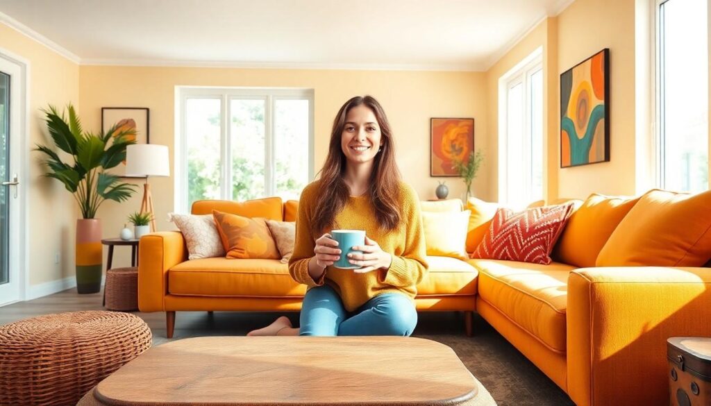
Living Room
In living rooms, analogous color schemes bring warmth and comfort. A combination of soft yellows, oranges, and reds creates an inviting atmosphere, making gatherings more enjoyable. Softer shades alleviate tension, allowing for relaxed interactions. This palette can also emphasize architectural features like fireplaces or built-in shelving. Incorporating varying textures within these hues, such as plush textiles or decorative elements, adds depth to the overall design. By using accessories in complementary analogous colors, designers can create contrast that enhances visual interest without overwhelming the space.
Bedroom
Bedrooms benefit significantly from analogous color schemes that promote tranquility. Shades of blue, blue-green, and green encourage restorative rest. This combination can evoke feelings of calmness, making it ideal for relaxation. Soft bedding and calming wall colors contribute to a serene retreat. Designers often layer colors through artwork, pillows, or rugs to create a cohesive look that feels chic yet comfortable. Choosing varied shades for window treatments or decorative accents helps maintain a smooth flow throughout the room, reinforcing the peaceful ambiance.
Office Spaces
Analogous color schemes in office spaces enhance creativity and productivity. Greens, blues, and teals foster a refreshing and focused atmosphere. These colors can influence mood positively, increasing motivation and concentration. Implementing these hues through wall colors or furniture choices provides visual stimulation without causing distraction. Adding plants in similar shades introduces nature, enhancing air quality and aesthetics. Additionally, accent colors in artwork or office supplies create a balanced environment that feels organized and cohesive. Choosing the right lighting with these colors can further amplify the inviting atmosphere, promoting a productive workspace.
Tips for Successfully Implementing Analogous Colors
Implementing an analogous color scheme requires thoughtful selection and balance. This approach creates cohesive spaces that evoke comfort and tranquility.
Choosing the Right Shades
Select shades that sit next to each other on the color wheel. For instance, using a dominant blue combined with blue-green and green amplifies harmony. Experiment with various tones to find a combination that resonates. Contrast is essential within the palette to add depth, so consider incorporating lighter and darker versions of the chosen colors. Designers often choose three to five hues to maintain visual interest while avoiding overwhelming the space. Testing samples in different lighting conditions helps ensure the colors complement each other effectively.
Balancing with Neutrals
Integrating neutral colors enhances an analogous color scheme. Neutrals provide a grounding effect, allowing the vibrant hues to shine without overwhelming the senses. Consider incorporating whites, grays, or earthy tones into the design. These shades soften the visual impact of the chosen colors, striking a balance between bold and serene. Effective neutral placement complements and highlights the dominant colors appropriately. Focus on using neutrals for larger surfaces like walls or furniture while allowing the analogous colors to fulfill accents. This combination reinforces a cohesive look throughout the space, creating a comfortable atmosphere.
Embracing an analogous color scheme in interior design offers a pathway to create inviting and harmonious spaces. By selecting colors that sit next to each other on the color wheel, designers can foster a soothing atmosphere that enhances the overall aesthetic. This approach not only promotes visual cohesion but also allows for playful contrasts that add depth and interest.
Whether in a cozy bedroom or a vibrant living room, analogous color schemes can transform interiors into tranquil retreats. The careful balance of hues and the incorporation of neutrals ensure that the vibrant palette enhances rather than overwhelms. Ultimately, this design technique stands out as a powerful tool for achieving a unified and appealing look in any space.