Table of Contents
ToggleInterior design isn’t just about picking pretty colors or arranging furniture until it looks “right.” It’s a discipline built on principles, testable, repeatable rules that separate spaces that work from ones that feel off, even if someone can’t explain why. These fundamentals apply whether someone’s furnishing a rental apartment or renovating a whole house. Understanding them gives DIYers the ability to make confident decisions about everything from paint selection to furniture placement, without hiring a designer or second-guessing every choice. This guide breaks down the core principles that professionals use, translated into practical terms for homeowners tackling their own projects.
Key Takeaways
- Interior design fundamentals—line, form, space, light, texture, and pattern—provide testable, repeatable rules that separate functional, intentional spaces from ones that feel off or incomplete.
- Balance distributes visual weight across a room through three approaches: symmetrical (formal and orderly), asymmetrical (casual and dynamic), or radial (arranged around a central point) to create equilibrium.
- Rhythm and repetition guide the eye through a space by repeating three to five key elements in color, shape, or texture, while progression and contrast add movement and interest without feeling chaotic.
- Scale and proportion are critical: furniture must match room size (measure before buying), ceiling height affects design choices, and the golden ratio helps determine relationships like a coffee table being two-thirds the length of a sofa.
- Color impacts mood, temperature perception, and spatial feel—warm colors advance and cozy spaces while cool colors recede and expand them—so test paint samples at different times of day before committing.
- Unity brings all elements together by creating a common thread through color palette, materials, or style; avoid the catalog effect by layering pieces from different sources and leaving negative space for the eye to rest.
Understanding the Core Elements of Interior Design
Before diving into specific principles, it helps to distinguish between elements and principles. Elements are the raw materials: line, form, space, light, color, texture, and pattern. Principles are the rules for combining those elements effectively.
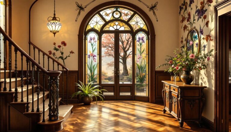
Line refers to both structural lines (where walls meet ceilings, door frames, trim) and decorative lines (in furniture edges, artwork, or textiles). Horizontal lines create a sense of stability and calm, think of a low-slung sectional or a long console table. Vertical lines draw the eye up and make ceilings feel higher, like tall bookcases or vertical shiplap. Diagonal lines add energy and movement but can feel chaotic if overused.
Form is three-dimensional shape: the silhouette of a chair, the profile of a lamp base, the overall geometry of a room. Forms can be geometric (sharp, angular, structured) or organic (curved, natural, flowing). Mixing both types adds visual interest without clutter.
Space includes both the physical footprint (square footage) and the perceived volume. Positive space is filled with furniture and objects: negative space is the breathing room around them. Amateur designers tend to overfill positive space, making rooms feel cramped even when they’re technically large enough.
Light, both natural and artificial, affects how every other element reads. A paint color that looks warm in morning sun can turn muddy under evening incandescent bulbs. Lighting deserves its own article, but the key point: plan for multiple light sources at different heights (ambient, task, and accent) rather than relying on a single overhead fixture.
Texture is tactile and visual surface quality: smooth leather, rough-sawn wood, nubby linen, polished metal. Layering textures prevents a space from reading as flat or sterile, even in minimalist designs.
Pattern is repeating design motifs, whether subtle (wood grain, woven texture) or bold (geometric wallpaper, striped rugs). Too much pattern competes for attention: too little can feel boring. Balance is essential.
Balance: Creating Visual Equilibrium in Your Space
Balance describes how visual weight distributes across a room. It’s not about physical weight, though a heavy oak credenza feels weightier than a glass side table, but about how the eye perceives mass and importance.
There are three types of balance:
Symmetrical balance mirrors elements on either side of a central axis. Think identical nightstands flanking a bed, matching table lamps, or a sofa centered on a window with equal space on both ends. Symmetry feels formal, orderly, and restful. It’s easy to execute and hard to mess up, which is why it dominates traditional and transitional interiors. The downside: too much symmetry can read as stiff or hotel-like.
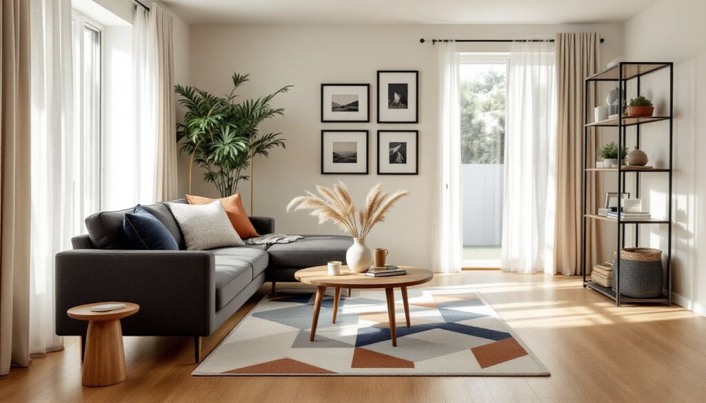
Asymmetrical balance distributes visual weight unevenly but still achieves equilibrium. A large sectional on one side of a room might balance with a tall bookcase and a pair of chairs on the other. This approach feels more casual and dynamic. It requires a better eye, homeowners need to consider size, color, texture, and placement simultaneously, but the payoff is a space that feels collected rather than decorated.
Radial balance arranges elements around a central focal point, like chairs circling a round dining table or a chandelier anchoring a room. It’s less common in residential design but works well in conversation areas or entryways.
When planning a room layout, step back (or take a photo) and squint. If one side feels “heavier,” adjust by moving objects, changing colors, or adding visual weight through texture or pattern.
Rhythm and Repetition: Guiding the Eye Through Design
Rhythm in design works like rhythm in music: it creates a sense of movement and flow by repeating elements in a predictable (but not monotonous) way. Without rhythm, a room feels disjointed, like individual pieces that happen to occupy the same space rather than a cohesive environment.
There are several ways to establish rhythm:
Repetition is the most straightforward: repeating the same color, shape, texture, or pattern throughout a space. Navy blue might appear in throw pillows, a rug, and artwork. Round forms might show up in mirrors, light fixtures, and side tables. The repetition doesn’t need to be exact, slight variations prevent it from feeling matchy-matchy, but the eye should recognize a common thread.
Progression (also called gradation) involves a graduated change in size, color, or tone. Examples include a gallery wall with frames increasing in size, or a gradient of paint shades from light to dark across adjacent walls. Progression creates a sense of movement and direction.
Transition uses curved or flowing lines to guide the eye smoothly from one area to another. An arched doorway, a curved sofa back, or a winding staircase all create visual transitions that feel organic rather than abrupt.
Contrast introduces deliberate opposition, dark against light, rough against smooth, large against small, to create visual interest and prevent monotony. Too much contrast feels chaotic: too little feels boring. Balance is essential.
In practical terms, aim to repeat three to five key elements throughout a room. More than that risks overcrowding: fewer can feel sparse or disconnected.
Scale and Proportion: Getting the Size Relationships Right
Scale refers to the size of an object relative to the space it occupies. Proportion refers to the size relationship between objects within that space. Get either one wrong, and even expensive furniture looks awkward.
A common mistake: undersized furniture in a large room. A small loveseat floating in a 20×20-foot living room looks lost, no matter how nice the upholstery. Conversely, a massive sectional crammed into a 10×12-foot den overwhelms the space and blocks traffic flow. Measure the room and the furniture before buying. Most retailers list dimensions: use painter’s tape on the floor to map out footprints before committing.
The golden ratio (approximately 1:1.618) shows up everywhere in design, from the proportions of a well-designed chair to the relationship between a coffee table’s length and the sofa it serves. Homeowners don’t need to calculate ratios, but a coffee table should generally be about two-thirds the length of the sofa. A dining table should leave 36–48 inches of clearance around all sides for chair pullout and passage.
Ceiling height affects scale dramatically. In rooms with 8-foot ceilings (standard in many homes), tall furniture can make the space feel squat. Low-profile pieces and furniture with visible legs (rather than skirted bases) create breathing room. In rooms with 10-foot or higher ceilings, skimpy furniture looks like dollhouse pieces. Go bigger, add height with tall bookcases or floor-to-ceiling curtains, and don’t be afraid of substantial lighting fixtures.
When mixing furniture styles or periods, pay attention to visual weight. A chunky farmhouse table can coexist with mid-century modern chairs if they share similar scale and proportions. Mismatched scale, delicate Queen Anne chairs around a rustic plank table, usually fails.
Color Theory and Its Impact on Interior Spaces
Color is the most powerful, and most intimidating, tool in interior design. It affects mood, perceived temperature, and spatial perception.
Understanding the color wheel helps. Primary colors (red, blue, yellow) mix to create secondary colors (orange, green, purple) and tertiary colors (red-orange, blue-green, etc.).
Complementary colors sit opposite each other on the wheel (blue and orange, red and green). They create high contrast and vibrant energy but can feel jarring in large doses. Use one as the dominant color and the other as an accent.
Analogous colors sit next to each other (blue, blue-green, green). They create harmony and flow but risk feeling monotonous without variation in shade, tone, or texture.
Monochromatic schemes use different shades and tints of a single color. They’re sophisticated and cohesive but require texture and pattern to avoid flatness.
Warm colors (reds, oranges, yellows) advance visually, making spaces feel cozier and smaller. They work well in north-facing rooms that get cool, indirect light. Cool colors (blues, greens, purples) recede, making rooms feel larger and calmer. They suit south-facing rooms with strong, warm light.
Value (lightness or darkness) matters as much as hue. Light colors reflect light and expand space: dark colors absorb light and add intimacy. A common guideline: use lighter values on ceilings and upper walls, medium values on main walls, and darker values on floors and lower elements to create visual grounding.
Test paint samples on multiple walls and observe them at different times of day. A gallon of paint covers roughly 350–400 square feet, so measure carefully and buy enough to complete the job in one batch (color can vary slightly between batches).
Unity and Harmony: Bringing It All Together
Unity (also called harmony) is the ultimate goal: making all the individual elements and principles work together so the space feels intentional and complete. It’s the difference between a room that looks decorated and one that looks designed.
Unity doesn’t mean everything matches. It means everything relates. A room can mix modern and vintage, bold and neutral, smooth and textured, as long as there’s a common thread tying it together. That thread might be a consistent color palette, a repeated material (like wood tones or metal finishes), or a unifying style sensibility.
One practical approach: choose a dominant element (a large rug, a piece of art, a boldly patterned sofa) and pull colors, textures, or shapes from it to use elsewhere in the room. This creates visual continuity without being overly literal.
Another technique: establish a focal point, the first thing the eye lands on when entering the room. It might be a fireplace, a picture window, a statement light fixture, or an accent wall. Arrange furniture to acknowledge the focal point rather than fight it. If a room lacks a natural focal point, create one with paint, wallpaper, or a gallery wall.
Avoid the “catalog effect,” where every piece comes from the same collection or looks like it was bought in a single shopping trip. Layer in items from different sources and time periods. Real homes accumulate personality over time.
Finally, know when to stop. Every room needs negative space, areas where the eye can rest. Overfilling shelves, walls, and surfaces creates visual noise that undermines all the other principles.
Conclusion
Mastering interior design fundamentals doesn’t require formal training or an unlimited budget. It requires attention to balance, rhythm, scale, color, and unity, and the willingness to experiment, adjust, and trust one’s own judgment. These principles aren’t rigid rules: they’re tools that give homeowners a framework for making decisions that result in spaces that look intentional and feel right. Start with one principle, apply it to a single room, and build from there.