Table of Contents
ToggleOpposition in interior design isn’t about conflict, it’s about balance. When a sleek glass table sits on a worn Persian rug, or matte black fixtures anchor a white-tiled bathroom, that tension creates visual interest. Designers call it opposition: the deliberate pairing of contrasting elements to make a room feel dynamic rather than flat. Without it, even well-furnished spaces can feel monotonous. Understanding how to deploy contrast, in color, texture, scale, and material, transforms a competent room into one that holds attention and feels intentionally composed.
Key Takeaways
- Opposition in interior design strategically pairs contrasting elements—such as color, texture, scale, and material—to create visual interest and prevent monotonous spaces.
- Contrast activates human perception and establishes visual hierarchy by directing the eye through a room and defining zones in open layouts.
- Opposition comes in multiple forms: color and tone contrast (high or low intensity), texture and material mixing (rough with smooth, reflective with matte), and scale balance (large statements with delicate accents).
- Apply the 60-30-10 rule when using opposition: allocate 60% to your dominant color or tone, 30% to a secondary contrasting element, and 10% to bold accent pops.
- Test opposition incrementally and consider your room’s function—social spaces benefit from high contrast while bedrooms and bathrooms work better with subtle textural opposition.
- Avoid over-layering multiple types of opposition simultaneously; choose one or two to emphasize while letting others play supporting roles for a curated, intentional look.
What Is Opposition in Interior Design?
Opposition refers to the strategic use of contrasting elements within a space to create visual tension and balance. It’s a core principle borrowed from art and architecture, where designers intentionally pair opposites, light with dark, rough with smooth, large with small, to prevent monotony and direct the eye.
The concept relies on juxtaposition. A room painted entirely in soft neutrals might feel serene, but without a contrasting element, a bold piece of art, a dark wood beam, or a textured throw, it risks feeling bland. Opposition gives the eye something to anchor on and creates a sense of movement through the space.
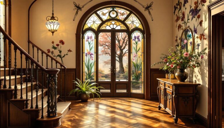
This isn’t randomness. Effective opposition requires intention. A mid-century modern chair placed in a farmhouse kitchen works because the clean lines contrast with rustic textures, but the proportions and color palette still tie the room together. Poor opposition, clashing styles with no common thread, reads as disorganized rather than dynamic.
Designers use opposition to establish focal points, define zones within open layouts, and add depth. It’s why a single black window frame can make a white room feel sharper, or why mixing metal finishes (brushed brass against matte black) adds complexity without clutter.
Why Opposition Matters: The Psychology of Contrast
Human perception thrives on difference. The brain processes contrast faster than uniformity, which is why a dark doorway in a light hallway draws immediate attention. In interior spaces, opposition leverages this neurological response to create rooms that feel engaging rather than static.
Visual hierarchy depends on contrast. Without it, the eye has no clear path through a room. A sofa, rug, and walls in similar tones blend together: add a contrasting accent wall or a bold coffee table, and the space gains structure. This is especially important in open-plan layouts where opposition helps delineate function, a dark kitchen island against light cabinetry signals a shift in use without requiring walls.
Contrast also affects perceived scale. A small room painted in a single pale color can feel larger but risks feeling empty. Introduce a deep accent color on one wall or dark trim, and the space gains definition without shrinking. Conversely, large rooms benefit from bold contrasts to avoid feeling cavernous.
From a psychological standpoint, opposition creates energy. A bedroom designed entirely in soft, monochromatic tones promotes calm but can feel lifeless. Adding textural contrast, linen bedding against a leather headboard, or a nubby wool throw on smooth cotton sheets, maintains tranquility while adding tactile interest. The space feels curated, not decorated by algorithm.
Types of Opposition in Interior Design
Color and Tone Contrast
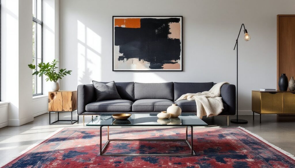
Color opposition is the most immediate form of contrast. It ranges from dramatic (black and white) to subtle (warm gray against cool gray). The key is value difference, how light or dark a color appears, not just hue.
High-contrast color schemes create bold, graphic spaces. Black kitchen cabinets with white subway tile and brass hardware deliver clear visual punch. This works well in modern or transitional styles where clean lines support strong color decisions. But high contrast requires commitment: it amplifies imperfections, so installation and finish quality matter more.
Low-contrast opposition is subtler. A living room in varying shades of beige might include a charcoal linen sofa or walnut coffee table. The contrast exists but doesn’t dominate, creating a sophisticated, layered look. This approach suits traditional or Scandinavian-inspired spaces where restraint is the goal.
Warm versus cool tones also qualify as opposition. Pairing warm wood floors with cool gray walls balances the visual temperature of a room. Too much warmth (honey oak, terracotta, brass) can feel dated: too much cool (white walls, stainless steel, concrete) can feel sterile. Mixing both creates equilibrium.
Texture and Material Opposition
Texture contrast adds dimension without relying on color. A room with smooth drywall, glass, and polished floors feels slick: introduce a jute rug, linen curtains, or a reclaimed wood shelf, and the space gains warmth and tactile variety.
Material opposition works across finish types. In a bathroom, matte porcelain tile contrasts with glossy subway tile or polished chrome fixtures. In a kitchen, honed granite countertops (matte finish) pair well with high-gloss cabinetry or stainless appliances. The interplay between reflective and non-reflective surfaces affects how light moves through the space.
Rough versus smooth is another classic pairing. Exposed brick (rough) against painted drywall (smooth) creates textural tension. A concrete countertop (industrial, porous) set against sleek bar stools or soft upholstered seating balances hard and soft elements. This is especially useful in loft or industrial-style spaces where too much raw material can feel cold.
Layering textiles is an accessible way to add opposition. A velvet pillow on a linen sofa, a wool throw over a leather chair, or a sisal rug under a glass coffee table, all introduce contrast without construction.
Scale and Proportion Contrast
Scale opposition involves pairing large and small elements to create visual interest and balance. An oversized pendant light over a small dining table, or a large sectional sofa anchored by delicate side tables, uses size contrast to define space.
This principle prevents monotony in furniture arrangement. A room filled with pieces of similar height, sofa, coffee table, console, all at knee level, feels flat. Introduce a tall bookshelf, floor-to-ceiling drapes, or a statement mirror, and the eye travels vertically, making the room feel more dynamic.
Proportion contrast also applies to architectural elements. Wide-plank flooring (8-inch or wider boards) contrasts with narrow shiplap or beadboard paneling. In trim work, chunky baseboards (5-6 inches) paired with delicate crown molding create depth. Mixing proportions adds complexity without additional color or material.
Be mindful of balance. Too many large-scale elements in a small room overwhelms: too many small pieces in a large room fragments the space. Aim for a mix: one or two statement pieces anchored by smaller supporting elements.
How to Successfully Apply Opposition in Your Space
Start with one dominant element and build contrast around it. If the room has dark hardwood floors, lighter walls and furniture create automatic opposition. If the walls are bold, keep larger furniture neutral and introduce contrast through accessories and accents.
The 60-30-10 rule helps manage contrast. Roughly 60% of the room (walls, large furniture) should be a dominant color or tone, 30% a secondary contrasting element (accent chairs, rugs, cabinetry), and 10% a bold pop (pillows, art, hardware). This prevents contrast from becoming chaos.
Test contrast incrementally. Paint a single accent wall before committing to a full room. Swap in a few high-contrast throw pillows or a rug before reupholstering furniture. Opposition works best when it feels intentional, not accidental, so observe how changes affect the room’s balance over a few days.
Consider the room’s function. High-contrast spaces feel energetic and work well in social areas (kitchens, dining rooms, entryways). Bedrooms and bathrooms often benefit from subtler opposition, textural contrast or tone-on-tone color schemes, to maintain calm.
Don’t forget lighting. Contrast shifts under different light sources. Natural daylight reveals true color and texture: incandescent bulbs warm everything: LEDs can skew cool. Test paint samples and material pairings under the actual lighting conditions of the space.
Avoid over-layering. More contrast isn’t always better. A room with bold color contrast, dramatic texture contrast, and extreme scale contrast simultaneously can feel exhausting. Choose one or two types of opposition to emphasize, and let the others play supporting roles.
Finally, trust the principle but adjust to taste. Opposition creates interest, but personal comfort matters. If high contrast feels jarring, dial it back. If a monochromatic room feels too flat, add a single bold element. The goal is a space that feels dynamic and intentional, not a showroom that no one wants to live in.