Table of Contents
ToggleBlue and white has anchored interior design for centuries, from Ming dynasty porcelain to New England colonial homes. The pairing isn’t just aesthetic, it’s psychological. Blue calms, white expands, and together they create spaces that feel both grounded and airy. Unlike trend-driven palettes that fade after a few seasons, this combination adapts to nearly every architectural style, climate, and personal taste. Whether someone’s aiming for a breezy coastal cottage or a formal traditional dining room, blue and white provides the foundation. This guide breaks down why the combination works, which styles lean on it hardest, how to choose the right shades, and where to deploy them throughout the home.
Key Takeaways
- Blue and white interior design has remained timeless for centuries because blue calms the eye while white expands space, creating rooms that feel both grounded and airy—a psychological balance that adapts across all architectural styles.
- When choosing shades for blue and white interiors, test paint samples in different lighting conditions and select cooler whites (with gray or blue undertones) paired with blues suited to each room’s function: soft blues for rest, navy for statement walls, and teal for energetic spaces.
- Incorporate blue and white strategically by anchoring one dominant color—either through walls, cabinetry, or upholstery—then layer in textures like linen and cotton to prevent the palette from feeling flat and clinical.
- The timeless appeal of blue and white design stems from its contrast and versatility: white reflects light and opens square footage while blue introduces depth, and together they balance warm and cool tones compatible with wood, metal, and natural textiles.
- Accent pieces like blue and white ceramics, patterned rugs, throw pillows, and carefully selected artwork elevate the look without overcrowding—the strength of blue and white lies in simplicity and negative space.
- Room-specific applications maximize impact: white cabinets with blue tile in kitchens, soft blues on bedroom walls, navy or cobalt grout in bathrooms, and saturated colors in entryways and hallways that serve as transitional spaces.
Why Blue and White Is a Timeless Color Combination
The durability of blue and white in design comes down to contrast and versatility. White reflects light and opens up square footage, while blue introduces depth without overwhelming the eye. The pair balances warm and cool tones, making it compatible with wood finishes, metal hardware, and natural textiles.
From a practical standpoint, white paint is the most common wall finish in residential construction, it’s the baseline. Adding blue means working with what’s already there, rather than against it. Paint companies consistently rank shades of blue among their top sellers, and white trim remains the default in most building specs.
Historically, blue pigments were expensive and reserved for high-status spaces. Indigo, cobalt, and ultramarine all carried cultural weight. White, by contrast, signaled cleanliness and simplicity. Together, they conveyed both aspiration and restraint. That duality still reads today.
The combination also plays well with natural light. In north-facing rooms with cooler daylight, warm whites and softer blues prevent the space from feeling sterile. In sun-drenched southern exposures, crisp whites and deeper navy tones keep things from washing out. The adaptability across lighting conditions is a major reason the palette endures.
Popular Blue and White Interior Design Styles
Coastal and Nautical Themes
Coastal design leans heavily on blue and white to evoke sand, sky, and water. The style favors natural textures, linen, jute, weathered wood, and avoids anything too polished. Paint choices tend toward soft aquas, pale sky blues, and crisp whites with minimal sheen. Trim is often painted in the same white as walls to reduce contrast and keep the look casual.
Nautical themes take a more literal approach: navy stripes, rope accents, brass hardware, and ship-inspired motifs. The blue skews darker and more saturated. Navy blue (close to Pantone 19-4028 or Benjamin Moore Hale Navy) pairs with bright white to create high contrast, which works well in rooms with strong architectural details like wainscoting or crown molding.
Both styles benefit from open shelving to display white ceramics, blue glassware, or woven baskets. Avoid overloading the theme with anchors and sailboats, subtlety keeps it from tipping into kitsch.
Classic Mediterranean and Greek Revival
Mediterranean interiors pull from the whitewashed villages of Greece, southern Italy, and coastal Spain. Walls are often finished in thick, matte white plaster or limewash paint. Blue appears in glazed tile, painted shutters, and upholstered seating. The shades range from cobalt to cerulean, with a slightly grayed or dusty undertone that softens the intensity.
Greek Revival architecture, common in the American South and Northeast, uses blue and white in a more formal register. Think Wedgwood blue walls with crisp white moldings, or white walls with blue and white toile fabrics. Crown molding, chair rails, and ceiling medallions provide the structure: the color palette keeps it from feeling too heavy.
Both styles emphasize natural materials, terracotta, stone, iron, and avoid synthetics. Floors are typically tile, stone, or wide-plank wood. Rugs, if used, are flat-weave or low-pile to maintain the clean, uncluttered look.
Choosing the Right Shades of Blue and White
Not all whites are neutral, and not all blues read the same under different lighting. White paint comes with undertones, some lean pink, others yellow or gray. In a blue and white scheme, cooler whites (with gray or blue undertones) harmonize better with most blues. Warmer whites work when the blue has green or teal notes.
Test paint samples on at least two walls in the room, one that gets direct sun and one in shadow. Observe them at different times of day. A blue that looks crisp at noon might turn muddy at dusk.
For blue shades, consider the room’s function and light exposure:
- Powder blue or sky blue: Best in bedrooms, bathrooms, or spaces meant to feel restful. Works well in smaller rooms because it doesn’t shrink the space.
- Navy or indigo: Strong enough for accent walls, built-ins, or rooms with high ceilings. Requires good lighting, either natural or layered artificial, to avoid feeling cave-like.
- Teal or turquoise: Adds energy: suits kitchens, mudrooms, or kids’ spaces. Balances warm wood tones.
- Denim or slate blue: Muted, versatile, and forgiving. Pairs with both modern and traditional furnishings.
Finish matters, too. Matte or eggshell hides wall imperfections and suits living areas. Satin or semi-gloss holds up better in high-moisture spaces like kitchens and baths, and makes trim pop against flat wall color.
How to Incorporate Blue and White Into Different Rooms
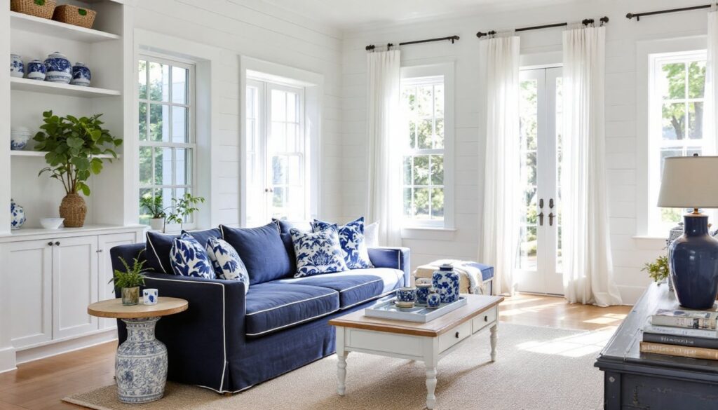
Living Rooms: Start with one dominant color. If walls are white, bring in blue through upholstery, curtains, or an area rug. A navy sofa with white piping and throw pillows creates a strong anchor. Alternatively, paint one wall or a built-in bookcase in a medium blue and keep the rest white. Layer in textures, linen, cotton, wool, to prevent the palette from feeling flat.
Kitchens: White cabinets with blue tile backsplash (subway, zellige, or hand-painted ceramic) is a proven combination. For a bolder move, paint lower cabinets navy and leave uppers white, or reverse it. Open shelving with white dishware against a blue wall adds visual interest without upper cabinets. Avoid all-blue cabinetry in small kitchens: it can feel heavy.
Bedrooms: Soft blues on walls promote rest. Use white bedding as the base and add blue through a duvet, quilt, or accent pillows. White furniture (dressers, nightstands) keeps the room feeling open. If the ceiling height allows, consider a blue ceiling, it mimics sky and adds an unexpected detail.
Bathrooms: Classic white subway tile with navy or cobalt grout adds contrast without busy patterns. White vanities and fixtures stay timeless: blue can appear in wall paint, mirrors, or towel hooks. In small powder rooms, a bold blue wallpaper with white fixtures makes a statement without long-term commitment.
Entryways and Hallways: These transitional spaces handle saturated color well. A high-gloss blue door (inside or out) with white trim and wainscoting sets the tone. Narrow hallways benefit from white walls and a blue runner to draw the eye forward.
Furniture and Accent Pieces That Elevate the Look
Furniture in blue and white schemes should either anchor the palette or provide contrast. A blue upholstered headboard or slipcovered armchair in linen or cotton brings softness. For harder surfaces, consider a painted wooden bench in a matte navy or a whitewashed console table.
Accent pieces tie the palette together without committing to large-scale changes:
- Blue and white ceramics: Ginger jars, vases, or planters work on shelves, mantels, or dining tables. Look for traditional patterns like chinoiserie or simpler modern designs.
- Throw pillows and blankets: Mix solids with patterns, stripes, checks, or block prints. Vary the scale to avoid a matchy-matchy look.
- Rugs: A blue and white patterned rug grounds a room. Traditional Persian or Turkish designs add history: geometric or abstract patterns feel more contemporary.
- Artwork and frames: White mats and frames highlight blue artwork or photography. Conversely, a gallery wall with mix-and-match blue frames on a white wall adds personality.
- Lighting: White linen or cotton lampshades soften overhead and task lighting. Blue glass pendant lights or ceramic table lamps introduce color at eye level.
Avoid cluttering surfaces with too many small accessories. The strength of blue and white lies in its simplicity, select a few well-made pieces rather than a collection of filler items. Let negative space do some of the work.