Table of Contents
ToggleWalk into any Starbucks, and there’s a distinct feeling, something between a modern coffee shop and a cozy living room. It’s no accident. The company has spent decades refining its interior design strategy, turning caffeinated pit stops into destinations where people linger, work, and return. Understanding what makes these spaces tick offers valuable lessons for anyone designing commercial interiors, home coffee bars, or communal areas. The design choices aren’t just aesthetic, they’re engineered to influence behavior, create comfort, and reflect local culture while maintaining brand consistency. Here’s how Starbucks builds environments that do more than serve coffee.
Key Takeaways
- Starbucks interior design evolved from cookie-cutter locations to hyper-local spaces around 2009, using reclaimed materials and local artwork to create community-specific environments that tell stories.
- The brand’s interior design strategy combines reclaimed wood, metal accents, layered lighting (2700K–3000K ambient tones), and varied seating to create the recognizable Starbucks experience while supporting the ‘third place’ concept.
- Strategic design elements like power outlets every 4–6 feet, acoustic planning (65–70 decibels), and sightlines to the barista area directly influence customer behavior and extend dwell time.
- Regional variations—from minimalist Japanese aesthetics with bamboo and shoji screens to European historic preservation and Pacific Northwest industrial heritage—demonstrate how Starbucks interior design respects local culture without compromising brand consistency.
- Environmental psychology drives every choice: warm neutral colors reduce distraction, furniture comfort encourages 1-hour stays without overnight camping, and temperature control (68–72°F) keeps customers alert and engaged.
- Effective Starbucks interior design balances accessibility features (USB ports, diverse seating), functional efficiency (traffic flow parallel to counters), and atmospheric elements (natural light, curated local art) to create spaces where customers linger, work, and return.
The Evolution of Starbucks Interior Design Philosophy
Starbucks didn’t start with a unified design playbook. Early locations in the 1990s leaned heavily on dark woods, earthy greens, and a formulaic approach that stamped out cookie-cutter cafés. Every store felt nearly identical, which built brand recognition but lacked soul.
The shift came around 2009, when the company launched its store design studios and began embracing heritage and locality. Gone were the days of one-size-fits-all interiors. Design teams started sourcing reclaimed materials from the neighborhoods where stores opened, salvaged wood from old barns, vintage factory lighting, local artwork. The goal was to make each location feel like it belonged to its community, not like a corporate drop-in.
This evolution aligned with broader consumer trends favoring authenticity and craftsmanship over mass production. Starbucks realized customers wanted spaces that told stories. A café in Portland might feature exposed brick and steel beams from a decommissioned warehouse. One in Tokyo could integrate traditional joinery techniques and minimalist aesthetics. The brand framework remained, but execution became hyper-local.
Key Elements That Define Starbucks Interior Aesthetic
Even though regional variations, certain design elements create the recognizable Starbucks experience. These aren’t arbitrary choices, they’re deliberate strategies to balance comfort, functionality, and brand identity.
Materials and Textures: The Warm, Inviting Foundation
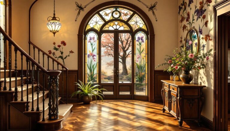
Reclaimed wood dominates Starbucks interiors. Tabletops, wall cladding, and counters often use salvaged lumber with visible grain, knots, and weathering. This isn’t veneer over particleboard, many locations use solid hardwood planks ranging from 1×6 to 2×10 nominal dimensions, finished with low-VOC oils or water-based polyurethanes to meet indoor air quality standards.
Metal accents provide contrast. Blackened steel frames, brushed brass fixtures, and industrial-style Edison bulb pendants add an urban edge without feeling cold. Concrete floors, often polished and sealed, offer durability in high-traffic areas while maintaining an artisanal vibe.
Textile elements soften the harder surfaces. Leather seating, wool-blend upholstery, and area rugs (typically low-pile commercial grade for easy maintenance) introduce warmth. The mix of rough and refined textures creates layered interest that holds attention longer than flat, monochrome spaces.
Lighting Design and Ambiance Creation
Starbucks uses layered lighting, never relying on a single overhead source. Ambient lighting comes from recessed cans or track systems with warm color temperatures (2700K–3000K), mimicking incandescent bulbs rather than harsh fluorescents. Task lighting over counters uses slightly cooler tones (3500K) for clarity during order prep.
Pendant fixtures serve as focal points. They’re positioned at varying heights to break up sightlines and create zones within open floor plans. Many locations use dimmable LED systems, allowing staff to adjust brightness based on time of day, brighter during morning rush, softer in evenings.
Natural light gets prioritized where possible. Large storefront windows, sometimes floor-to-ceiling, connect interiors to streetscapes. Window treatments stay minimal, sheer panels or no coverings, to maximize daylight penetration while managing glare with strategic furniture placement.
The ‘Third Place’ Concept and How Design Supports It
Starbucks built its empire on the ‘third place’ philosophy, a space between home and work where people gather, relax, and feel comfortable for extended periods. Designer considerations directly support this mission.
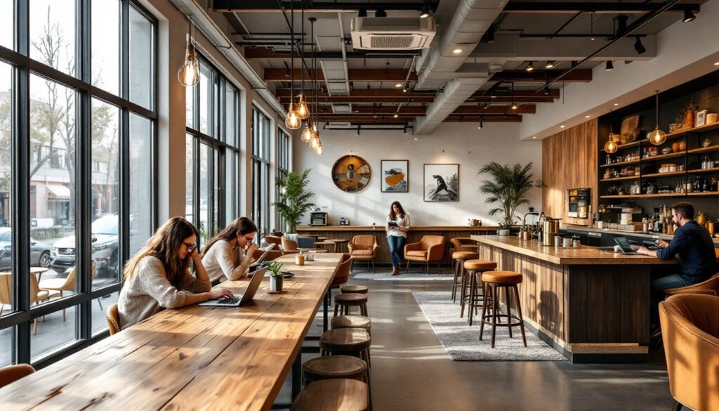
Seating variety is intentional. Communal tables with butcher-block tops encourage laptop work and casual meetings. Upholstered lounge chairs arranged in clusters invite conversation or solo reading. Bar-height counters along windows suit quick visits or people-watching. This mix accommodates different needs without forcing everyone into the same furniture style.
Power outlets and USB ports are embedded into walls, under counters, and in tabletop boxes, acknowledging that modern “third places” require connectivity. Locations built after 2015 typically include outlets every 4–6 linear feet along walls, far exceeding residential code minimums.
Acoustics get careful attention. Hard surfaces (wood, concrete, metal) reflect sound, which can create energy but also chaos. Starbucks mitigates this with acoustic ceiling panels, upholstered furniture, and sometimes wall-mounted fabric-wrapped absorbers. Background music stays at 65–70 decibels, loud enough to mask individual conversations (providing privacy) but not so loud it prevents focus.
Bathroom design matters more than most realize. Clean, well-lit restrooms with quality fixtures signal that management cares about the complete experience, not just what happens at the register.
Regional Variations and Local Design Integration
Starbucks stores in different markets showcase how global brands can respect local context without losing identity. This isn’t decoration, it’s strategic adaptation.
In Japan, locations often feature minimalist lines, natural materials like bamboo and cedar, and sliding shoji-inspired screens that partition space without full walls. The aesthetic honors traditional architecture while maintaining the coffee shop’s modern functionality.
European stores lean into historic buildings. A Paris location might preserve 19th-century moldings and parquet floors, inserting contemporary coffee bars as clean contrasts rather than trying to match period details. Exposed stone walls in Rome or Barcelona stay visible, celebrated as texture rather than hidden behind drywall.
U.S. regional differences exist too. Pacific Northwest stores embrace industrial heritage, exposed ductwork, steel I-beams, and raw materials reflecting the region’s manufacturing past and outdoor culture. Southern locations might incorporate wrought iron details and warmer color palettes. Urban stores maximize vertical space with mezzanines or lofted seating: suburban drive-thru locations emphasize efficiency and quick flow.
Local art programs source pieces from nearby artists, rotating exhibitions that give communities ownership of the space. This isn’t generic corporate art, it’s curated to reflect neighborhood character.
How Starbucks Interior Design Influences Customer Behavior
Every design choice nudges behavior in specific directions. Starbucks understands environmental psychology better than most retailers.
Traffic flow follows careful planning. The ordering queue runs parallel to the pickup counter, keeping lines from blocking entry. Seating closest to the door tends to be bar-height or quick-service tables: deeper into the space, furniture gets more comfortable, encouraging longer stays.
Color psychology plays a role. Warm neutrals (taupes, tans, soft grays) dominate because they’re non-distracting and broadly appealing. Green accents tie to brand identity without overwhelming. Bold colors appear sparingly, maybe in artwork or a single accent wall, to energize without overstimulating.
Sightlines to the barista area are intentional. Watching coffee preparation builds anticipation and reinforces quality perception. Open layouts with minimal visual barriers between customers and staff create transparency, suggesting nothing’s hidden.
Temperature control matters more than people realize. Stores maintain 68–72°F, cool enough to keep customers alert, warm enough to feel welcoming. Overly warm spaces make people sluggish or eager to leave.
The aroma isn’t designed, but it’s protected, Starbucks avoids heavily scented cleaning products or air fresheners that would compete with coffee’s natural smell, which alone triggers comfort and routine associations.
Furniture durability balances comfort with turnover. Seats are comfortable enough for an hour but not so plush that customers camp all day without purchasing. Table sizes accommodate laptops and drinks but not sprawling work setups that monopolize space during peak hours.
These aren’t manipulative tricks, they’re thoughtful design choices that align business needs (table turnover, efficient service) with customer desires (comfort, functionality, atmosphere). When executed well, both sides win.